Color Palette developed around our brand’s primary teal. Additional colors were chosen to strike a balance of neutrals with occasional pops of color that differentiate from the principal brand.
A full library of icons was created to represent key reasons to become a Pampered Chef consultant: Purpose, Community, Flexibility, Rewards and Incentives, and Income.
Developed a library of social assets for the brand's social channels. These were also made downloadable for consultant-use and resulted in some of our highest downloads to date.


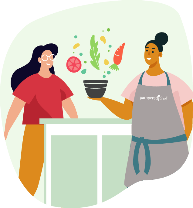
In addition to establishing the look and feel for recruiting-centric illustrations, I also built a mini-library of bespoke illustrations to represent each party type. From left to right these depict Virtual Parties, Catalog Parties, and In Person Parties.
This proposed layout helped illustrate how all of the elements would come together in print collateral, like our new consultant brochure.
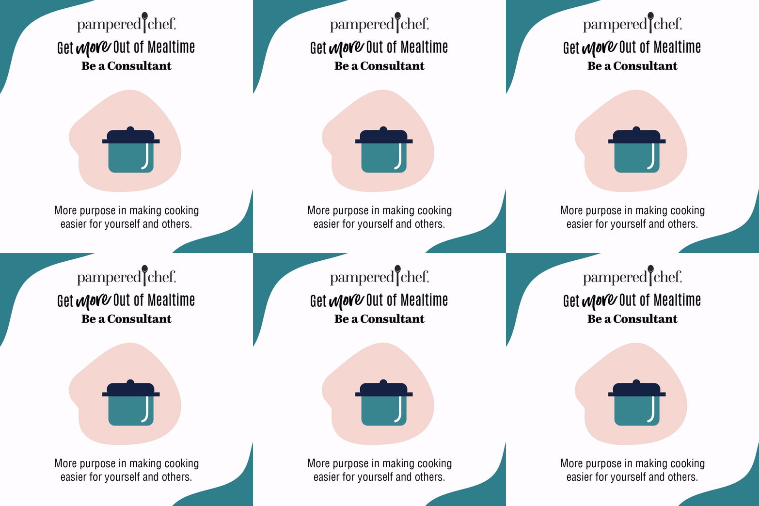
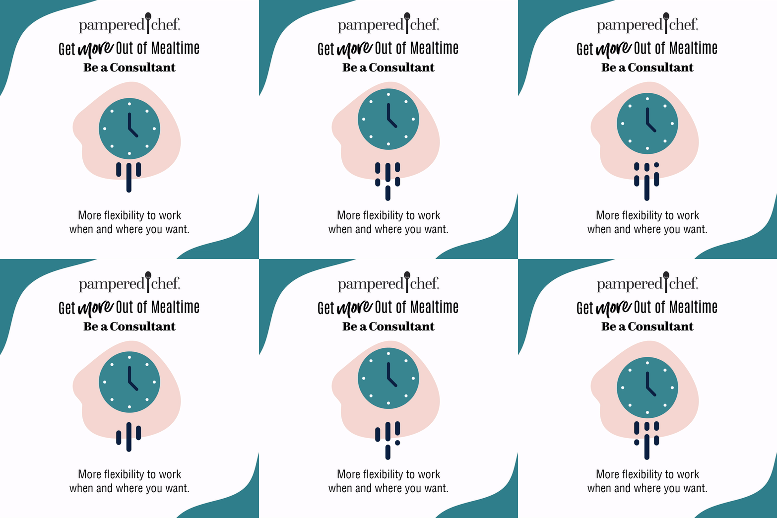
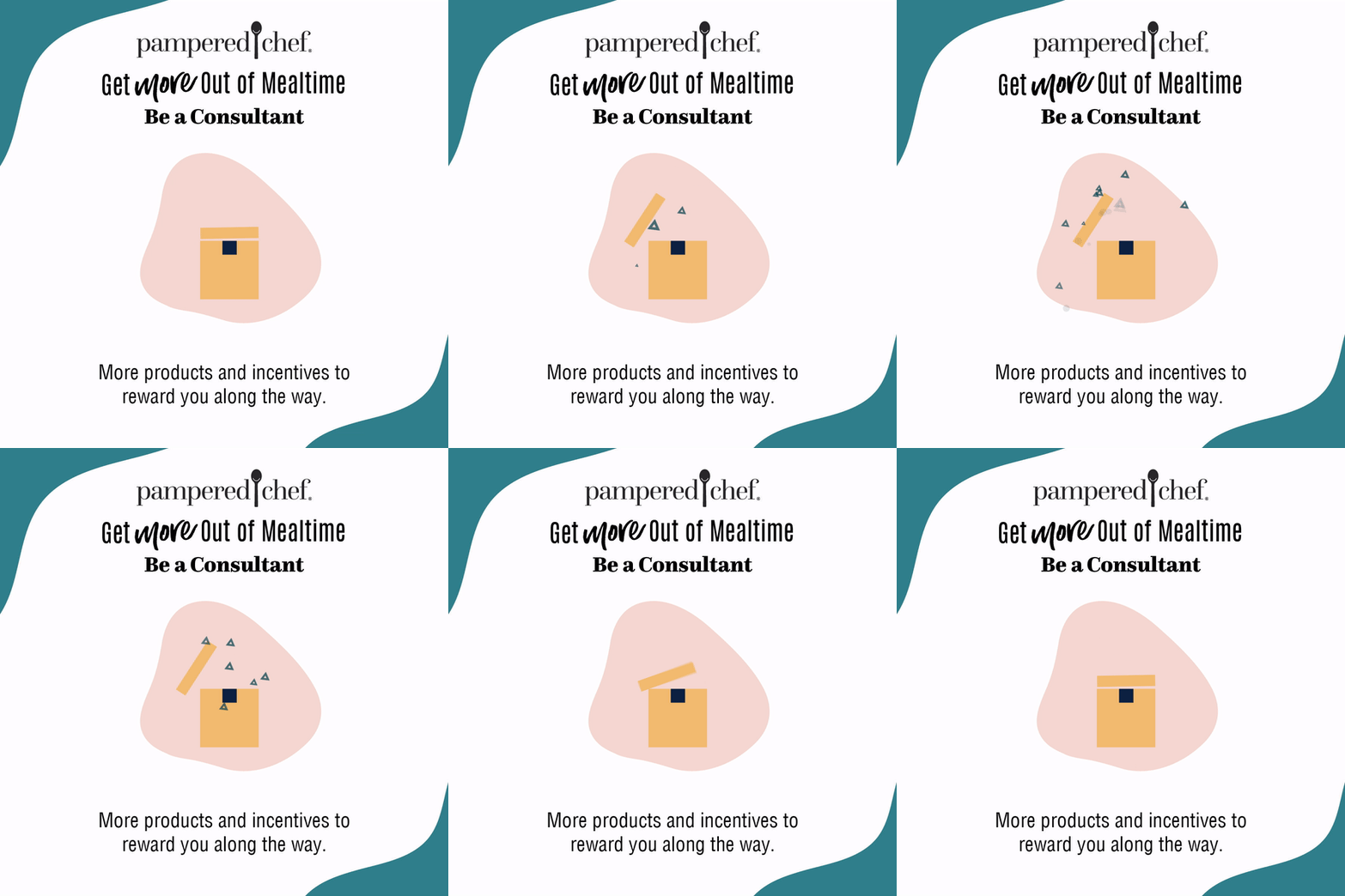
Animated content generally performs better, so I created some quick animated versions of each icon. These were applied to paid ads for social.
